Colors are incredible.
They have the power to influence our mood, to attract or repel us, and to draw up distinctive memories and associations.
That’s why businesses use personal branding colors in strategic ways. They know specific colors will project the right image and draw the right audience.
For instance:
- The color pink can make us think of soft stuffed animals, cotton candy, and babies. 👶🏻
- The color blue might soothe our minds, remind us of the sky or the ocean, or even make us feel depressed. 🌊
- We might be drawn to the color green, be repelled by red, or have happy memories associated with yellow. 🌞
84.7% of consumers say color is the primary reason they buy a product…
And 80% say color helps increase brand recognition.
So you can see why choosing the right personal branding colors is essential.
Your branding is your calling card online. It appears everywhere – on your website, on social media, in your email signature, on your content, and beyond.
Using the right personal branding colors could mean the difference between attracting your ideal customers or turning them away.
The colors you choose should represent your brand identity, what you value, and what you hope to achieve.
In other words, how do you want the world to see your business? Your branding colors can help make it happen.
How to Choose Personal Branding Colors & Project the Right Image
I discuss this topic on my podcast, too. 🎧 Listen to the episode to learn about the psychology of colors and how to choose your best branding colors.
1. Know the Psychology of Colors and What They Communicate
Color psychology is a great place to start when choosing your personal branding colors. This is the study of how each color affects our moods, perceptions, and emotions.
Colors are powerful communicators. Thus, the question color psychology seeks to answer is, “What messages does each color communicate?” These may stem from cultural traditions, nature, symbolism, pop culture, folklore, trends, and more.
Color associations also change depending on where you go in the world. For instance, many Eastern cultures often associate white with death, funerals, mourning, and sadness. Meanwhile, Western cultures tend to associate white with innocence, purity, and peace.
The psychology of color is all about the associations, symbols, and meanings behind each color, which can be super useful for branding.
Here are the most popular color associations in Western culture:
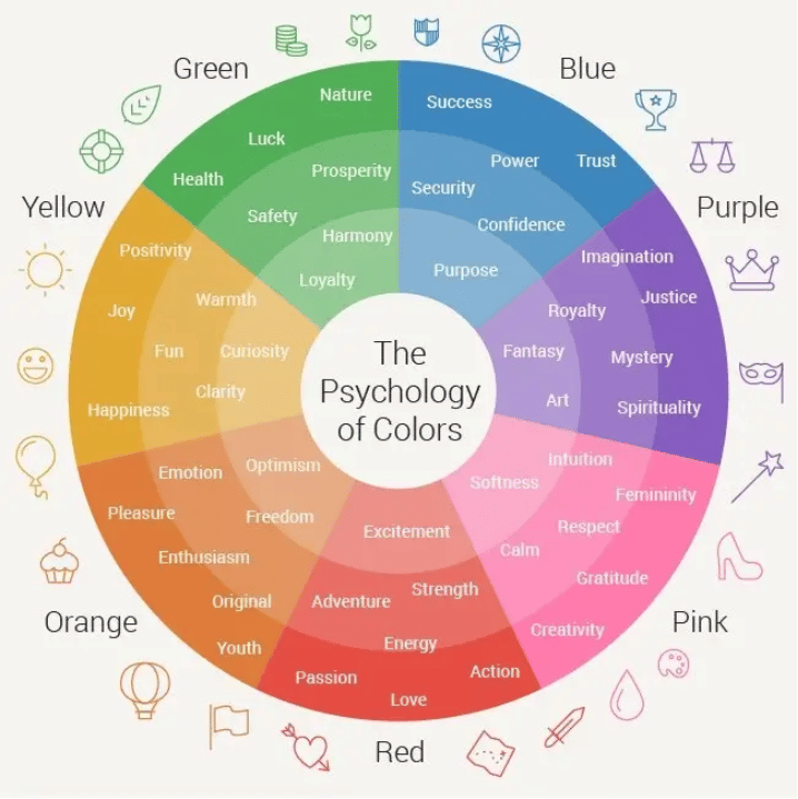
Source: Wordstream
- Red – Energy, excitement, passion, strength, urgency, danger, appetite, love.
- Orange – Enthusiasm, vitality, youthfulness, impulsiveness, creativity, adventure.
- Yellow – Cheerfulness, curiosity, playfulness, joy, fun, optimism.
- Green – Wellness, harmony, nature, luck, refreshment, relaxation, wealth, abundance.
- Blue – Calm, security, trust, stability, purpose, confidence.
- Purple – Imagination, royalty, spirituality, mystery, fantasy, luxury, sophistication.
- Pink – Romance, femininity, softness, youthfulness, sweetness.
- White – Innocence, purity, cleanliness, peace, simplicity, minimalism.
- Black – Sophistication, elegance, power, mystique, edginess.
- Brown – Earthy, warm, classic, honest, wholesome, down-to-earth.
2. Connect Brand Adjectives to Colors
It can be tough to choose a color when you’re staring at a rainbow of them or looking at a long list of color associations.
So many choices! So many possibilities!
If this is overwhelming, return to what’s at stake here: your brand.
To narrow things down, start by making one choice: one main color that will be the star of the show. This color will run through every aspect of your branding and website and should evoke the main emotions and associations you want to be tied to your brand.
This is why you should never, ever, skimp on your website!
You should hire a website designer who understands the role color plays in site design. This will help you get a website primed to be a conversion machine.
FYI, my husband Josh and his team at Content Hacker Projects can help you build a website that “speaks your color language”. 😎
In fact, they can design a custom, science-backed color palette to bolster your branding and brand identity.
Want in on this? Check out Content Hacker Projects to get started brand-building OR rebranding. 🎨
Back to choosing the right colors for your brand…
Here’s how to choose:
- Brainstorm and write down a list of adjectives that describe your brand. Think about your story, what you sell, and how you want to be perceived.
- Think of what emotions you want to evoke in prospects who experience your brand and buy from you. Write those down, too.
- Return to the list of color associations and start making connections. For example, if your list of words includes joy, wonder, and fun, a shade of yellow might be a good choice for your main branding color.
After you choose a main branding color, expand on your initial color choice and complement it by choosing a brand color palette. 🎨
3. Choose a Brand Color Palette
As you choose your branding colors, picking one hue and splashing it everywhere, ad nauseum, will end up looking flat and amateurish.
Instead, it’s a better idea to choose a brand color palette that will feature one or two main colors along with some supporting colors.
Choosing a brand color palette will help all of your branding look more dynamic and cohesive, from your website to your logo to your social media and emails.
For example, at Content Hacker, our palette consists of deep purples, muted blues, and soft pinks. You’ll see variations on this palette across our website and branding.

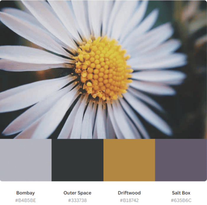
To help you choose a brand color palette, consider using tools like Coolors or Canva. These allow you to create palettes based on individual colors or even based on pictures you upload.
4. Consider Color Theory
Knowing and understanding color theory will go a long way toward helping you choose your branding colors – including your color palette.
In the art world, color theory is a set of guidelines for how to mix and combine colors to achieve a working, harmonious palette.
For example, the traditional color wheel is a foundation of color theory. It was originally developed by Sir Issac Newton and shows the relationships between colors. It’s broken down like this:
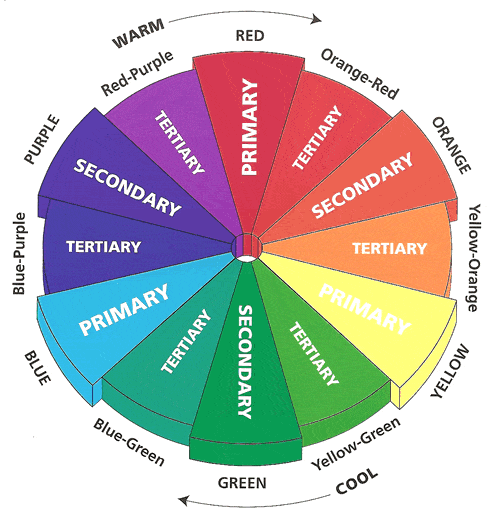
Source: Colorguides.net
Primary colors: red, yellow, and blue. These colors are pure, which means they can’t be created by mixing any other colors. However, you can mix primary colors to create other colors.
Using these colors in a brand palette is bold, bright, and eye-catching. Burger King is a good example:

Secondary colors: orange, green, and purple. These colors result when you mix two primary colors. Example: blue + yellow = green. When you combine them in a brand color palette, you get a similar effect to combining primary colors.
Tertiary colors: These colors result when you mix a primary color with a secondary color. Example: blue + green = blue-green.
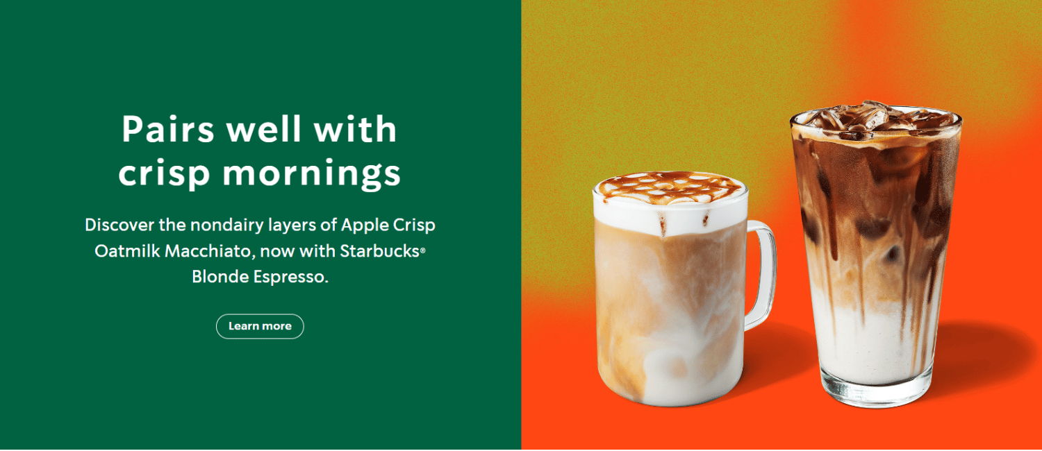
Complementary colors: colors that exist across from each other on the color wheel (blue and orange, green and red, yellow and purple). These colors are opposites and therefore pop when used in the same color scheme.
On its website, Starbucks uses orangey-red, a complementary color to its usual green, to highlight seasonal drinks.
Analogous colors: colors that exist side-by-side on the color wheel. This scheme is often used with one shade as the dominant color with two or three accent colors.
Ally, an online bank, is a good example of a brand that uses analogous colors (purple with blue and green accents).

Monochromatic colors: one color on the color wheel, plus shades and tints of that color. Shades = black is added to the color in various amounts to darken it. Tints = white is added to lighten it.
For a company with monochromatic branding, look to PayPal. They exclusively use shades and tints of blue.
As you can see, color theory can give you a lot of options for brand palettes after you choose a main branding color. Best of all, these color combinations are proven to be harmonious and pleasing, so you’ll never end up with branding that looks like an art experiment gone wrong…
Like this:

(To be fair, this is an art department page. Maybe it’s not supposed to make sense. 🤷♀️)
5. Don’t Choose Personal Branding Colors Based on Your Preferences Alone
Last tip.
Choosing colors can be really difficult, especially if you don’t consider yourself a creative person.
As a result, your knee-jerk instinct might be to choose branding colors based on the colors YOU like. For example, if you love green, you might naturally gravitate toward it for your branding.
But – don’t make that mistake.
You’re thinking about what YOU like right now. Instead, you should be thinking about what your ideal customer will be drawn to.
For instance, is a zany lime green the right color for a prestige content writing brand? 🐸 Should a marketing agency serving kids’ brands choose an inky black to represent them? 🎩
They could. But they would be ignoring color psychology and the preferences of their ideal audiences. And that could burn them later on.
Keep that in mind before throwing up your hands in defeat and choosing your favorite color for your branding.
This might take more than afternoon. But it deserves time and thought!
Personal Branding Colors: Build Your Brand One Brick at a Time
If you’re in the midst of brand-building, your personal branding colors may seem like a silly thing to think about.
Shouldn’t you focus on more important things? Branding can wait, right?
Actually, figuring out your branding colors is a giant step toward building the foundation of your brand. 🗻
Your brand colors help tell the story of your business. They speak volumes to customers and may help draw the right ones to you.
It’s important, so don’t be afraid to give it some time and care.
And if you’re struggling with any part of brand-building, yet want to build a brand that resonates with your target audience, then get in touch with the team at Content Hacker Projects.
Not only can they help you build websites, but their expertise in brand building can be invaluable in helping you know which personal branding colors to adopt.
Ready to start building a website that reflects your brand perfectly? Start here.


